ARCHIVE · 2024 · UW HCDE 537 · CLIENT PARTNERSHIP
Helping shoppers understand Leilo before they buy
Leilo makes alcohol free beverages with kava, an ingredient many shoppers were unfamiliar with. The website needed to help people understand the product as they considered buying it.
Over ten weeks, I worked with a team of four on research, UX design, and information architecture. We focused on clearer product information, ingredient education, and a simpler path to purchase.
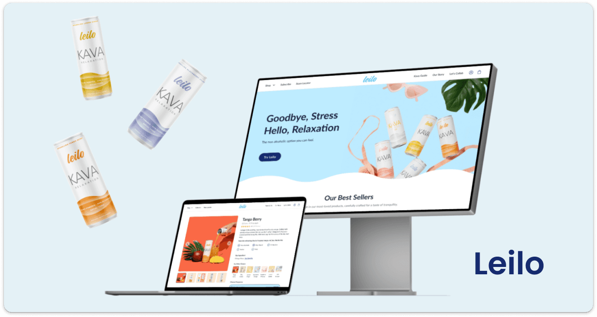
We used customer research to reorganize navigation, clarify product information, and simplify the shopping flow. In the final usability comparison, the prototype received higher satisfaction and clarity ratings, with a lower average task completion time.
Understanding what shoppers needed to know
We reviewed web analytics, spoke with stakeholders and customers, and studied other brands in the category to understand what the website needed to communicate.
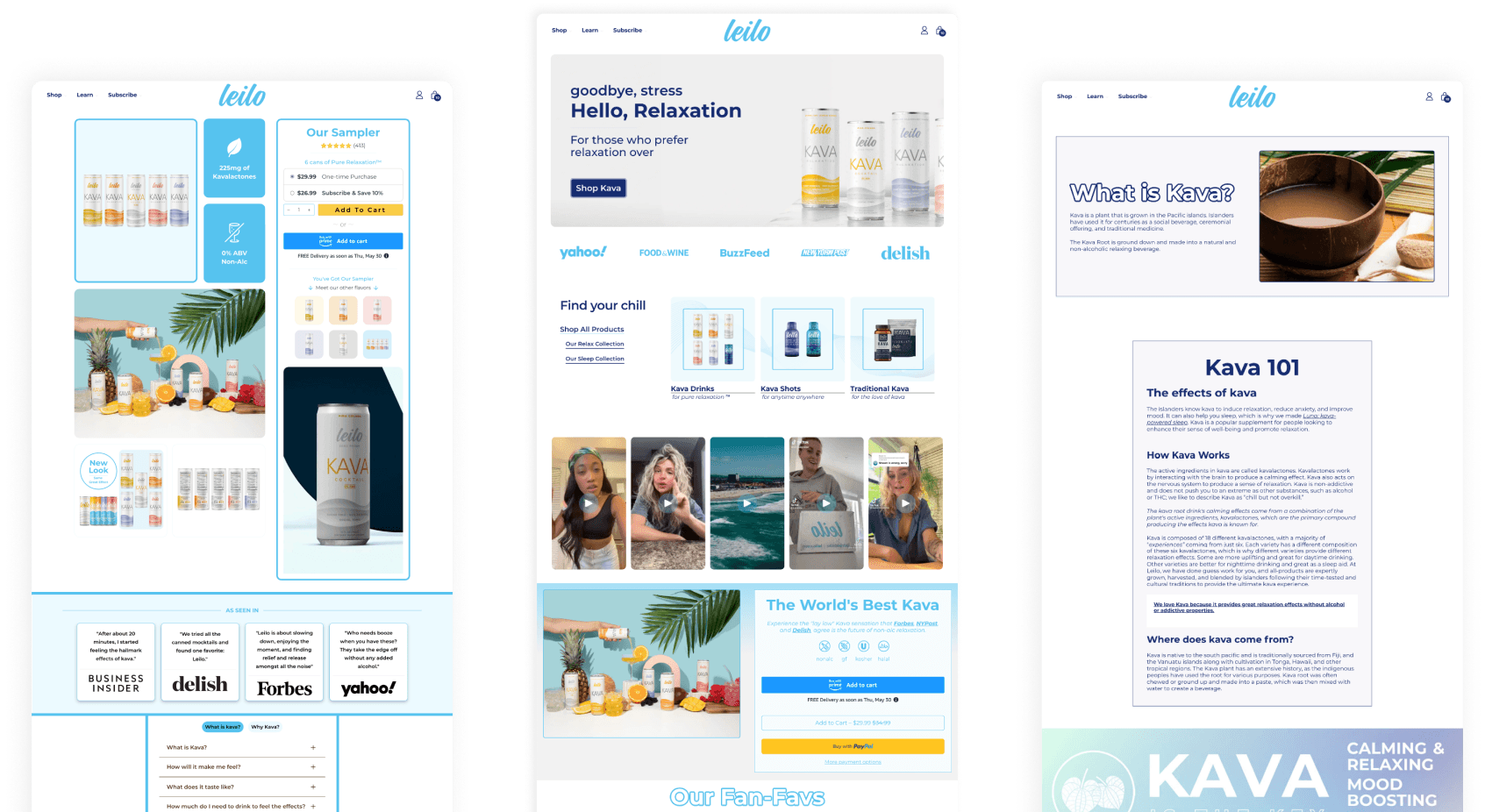
The site had plenty of information, but shoppers still struggled to understand the products. We used a Jobs To Be Done map to connect what customers wanted to accomplish with the information they needed along the way.
For shoppers unfamiliar with kava, shortening the copy alone would not answer their questions. We needed to make ingredients, product details, and safety information easier to find while keeping the pages approachable. That balance guided the redesign.
Different reasons to consider Leilo
Our interviews informed three personas with different priorities: staying sober, supporting an active lifestyle, and finding a way to unwind. They helped us consider which details each shopper would need before deciding whether Leilo was right for them.

After two years in recovery, he wants to maintain his sobriety while feeling included in social occasions. Taste, availability, and clear ingredient information matter when choosing a drink.
- AGE
- 28
- OCCUPATION
- Financial analyst
- INCOME
- $130,000
“I would like to have a non-alcoholic drink when I hang out with my friends. Seeing everyone with their drinks makes me feel left out.”
- Maintain his sobriety.
- Find socially acceptable non-alcoholic beverages.
- Maintain a healthy lifestyle.
- A non-alcoholic drink that gives a similar experience to alcohol.
- A drink that tastes good.
- Easy access to ingredient information and benefits.
- Limited non-alcoholic options for social occasions.
- Feeling left out or tempted to drink when everyone else is having a drink.
- Difficulty finding non-alcoholic beverages that taste good.

Andy is a personal trainer who avoids alcohol and considers how ingredients fit his health and performance goals. He wants clear information and evidence behind product claims.
- AGE
- 26
- OCCUPATION
- Personal trainer
- INCOME
- $105,000
“Every ingredient I consume is a choice for my health. That is why I steer clear of alcohol; it does not make the cut for my performance standards.”
- Explore ingredients and foods that benefit post-workout recovery.
- Find non-alcoholic beverages tailored to athletes.
- Buy drinks known for their recovery benefits.
- A non-alcoholic beverage that supports recovery and maintains performance.
- Products scientifically proven to be effective for athletes.
- Clear, detailed information on ingredients and their benefits.
- Hard to find non-alcoholic beverages marketed toward athletic recovery.
- A saturated market makes it hard to tell which products genuinely help.
- Needs assurance a drink will not undermine his fitness goals or health.

Sarah has a demanding corporate job and wants to unwind without relying on caffeine or alcohol. She is looking for an enjoyable drink that fits her routine.
- AGE
- 35
- OCCUPATION
- Marketing manager
- INCOME
- $280,000
“Work has been intense lately. I would like some coffee to get me through the day, but I know it is not the best for me.”
- Reduce caffeine and its effects on sleep and health.
- Find a non-alcoholic beverage that helps her relax and relieves stress.
- Maintain a healthy work-life balance.
- A non-alcoholic beverage with relaxing qualities.
- A drink that tastes good and is pleasant to drink.
- Easy access to ingredient and benefit information.
- Few non-alcoholic options that provide relaxation and stress relief.
- Hard to find suitable alternatives for social occasions where alcohol is expected.
- Tempted to use caffeine or alcohol to cope with stress.
Organizing the site around those needs
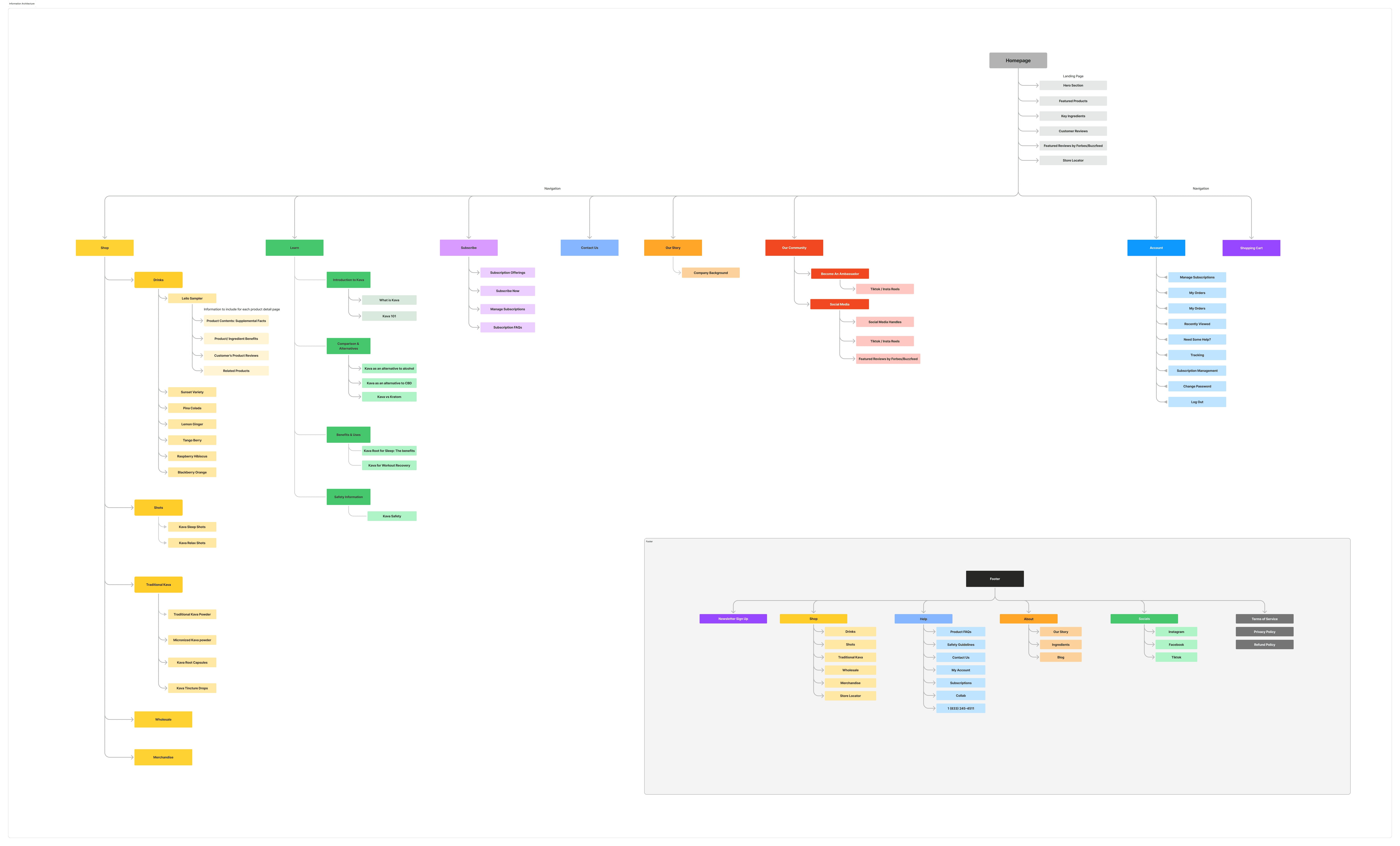
With those needs in view, we used card sorting to understand how customers grouped the content. Usability testing showed where they struggled to find information or understand their options. Together, these findings guided the navigation and helped us prioritize what to clarify.
Making product information easier to use
The research gave us a direction: help shoppers find the information they need, understand their options, and see what to do next. We translated that direction into wireframes and a prototype.
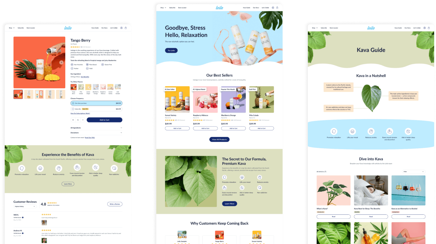
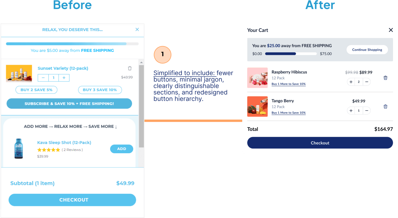
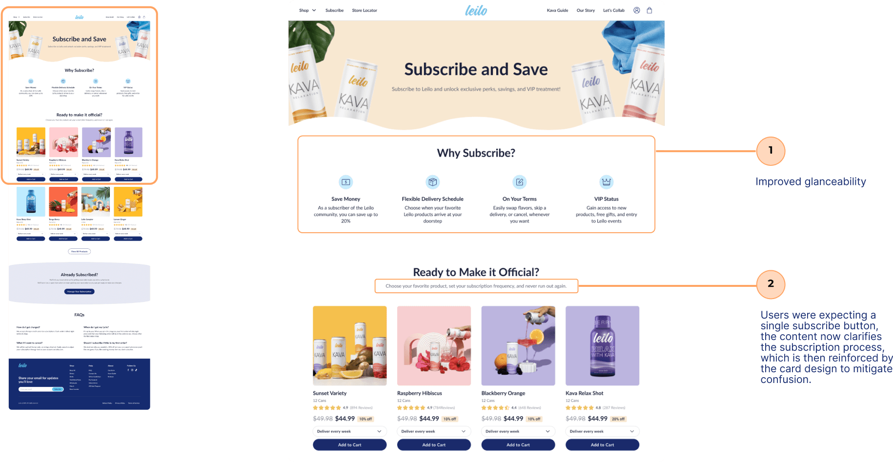
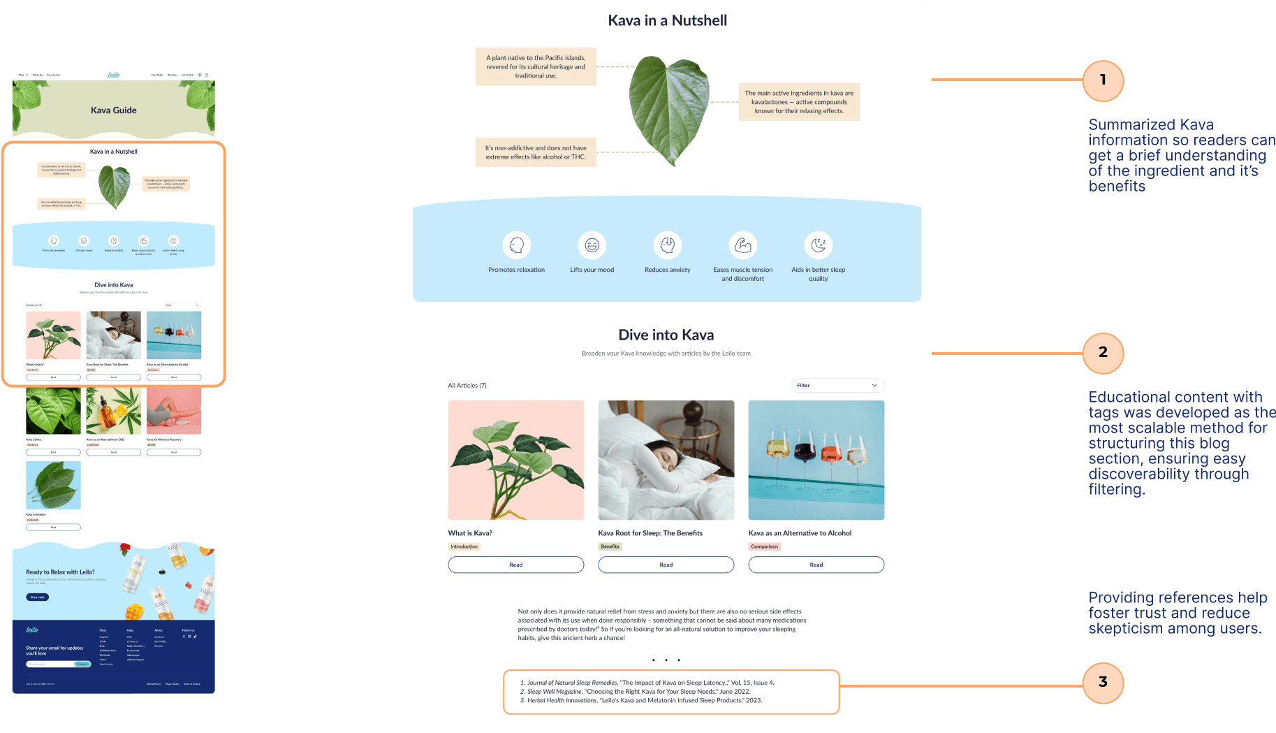
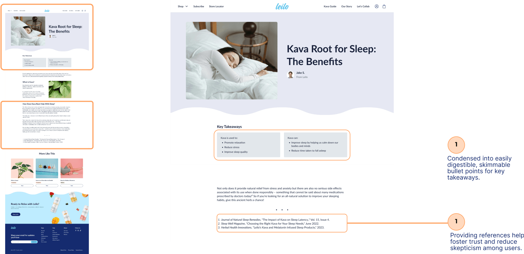
We reorganized navigation around the card sorting results, broke long product descriptions into shorter sections with visual cues, and simplified the checkout layout. Each change connected a research finding to a specific part of the shopping experience.
Refining the details through testing
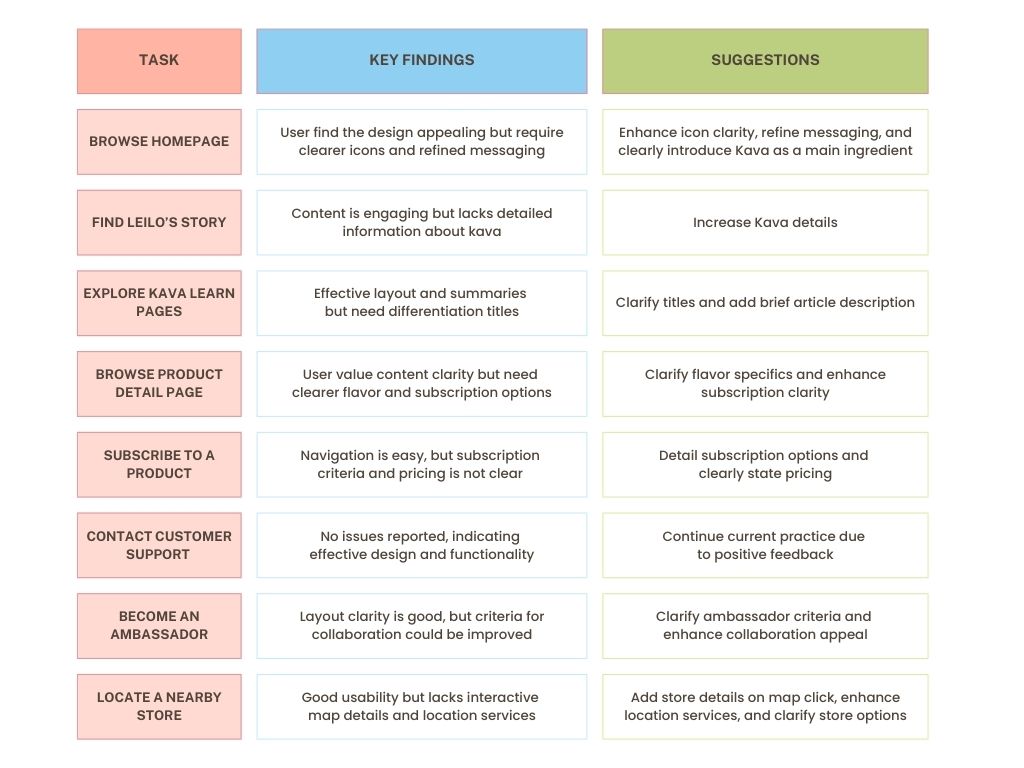
Testing the initial prototype showed what still needed work: clearer icons, more specific flavor information, and better explanations of subscription pricing. We used that feedback to refine the content and interactions before the final comparison.
How the changes work together
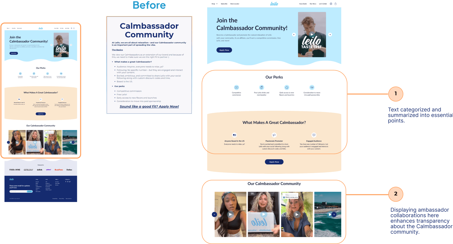
The comparisons below follow the experience from discovering Leilo to choosing a product and checking out. Each shows how the content, navigation, or interaction changed to support that decision.
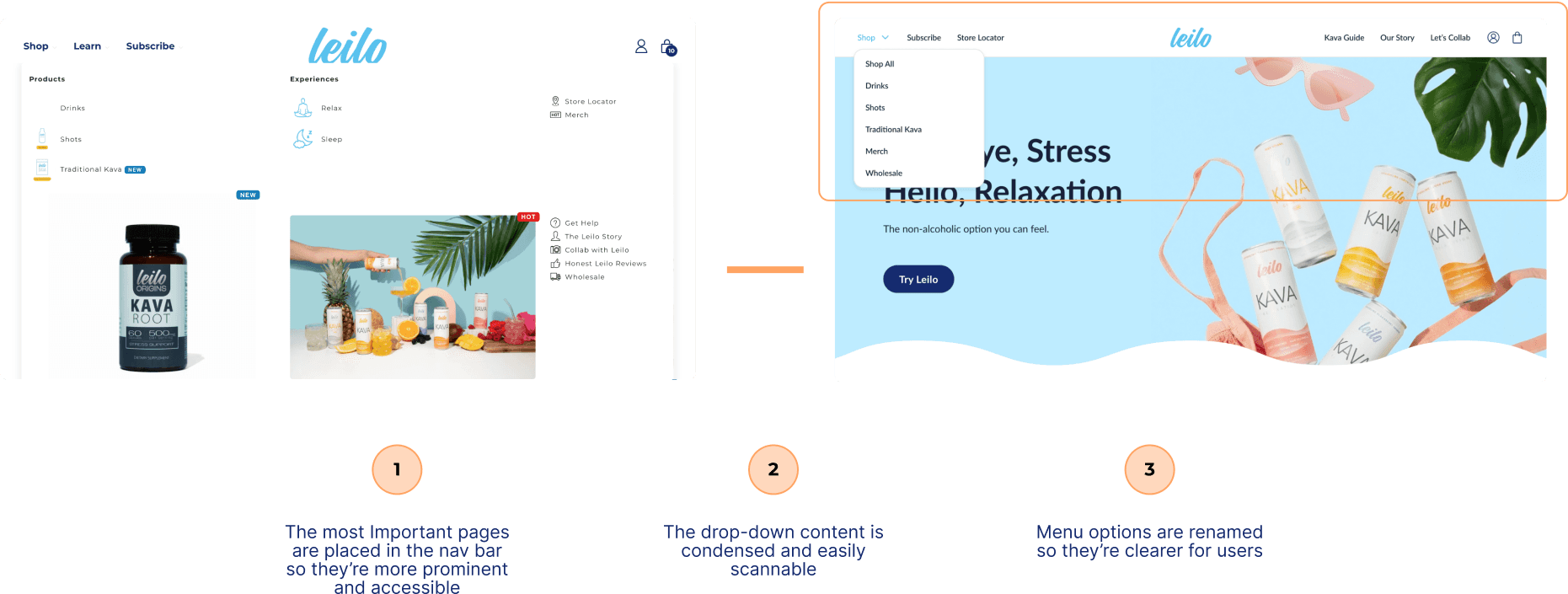
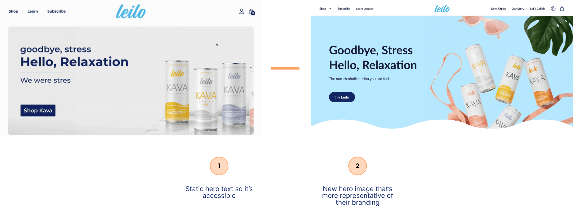
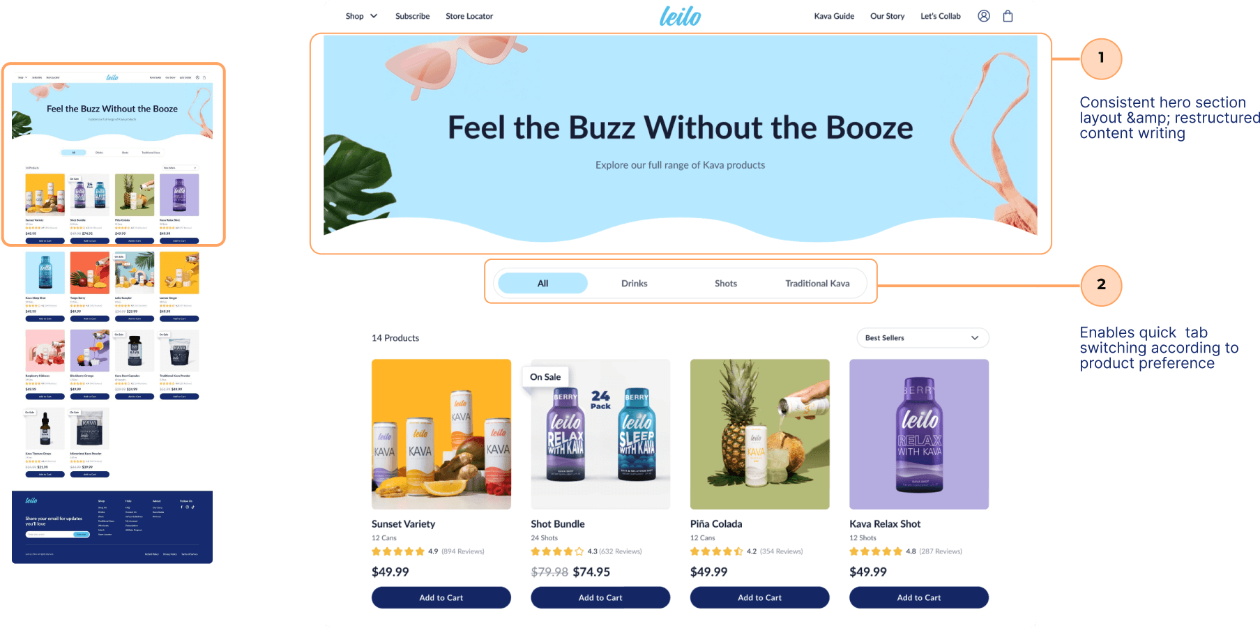
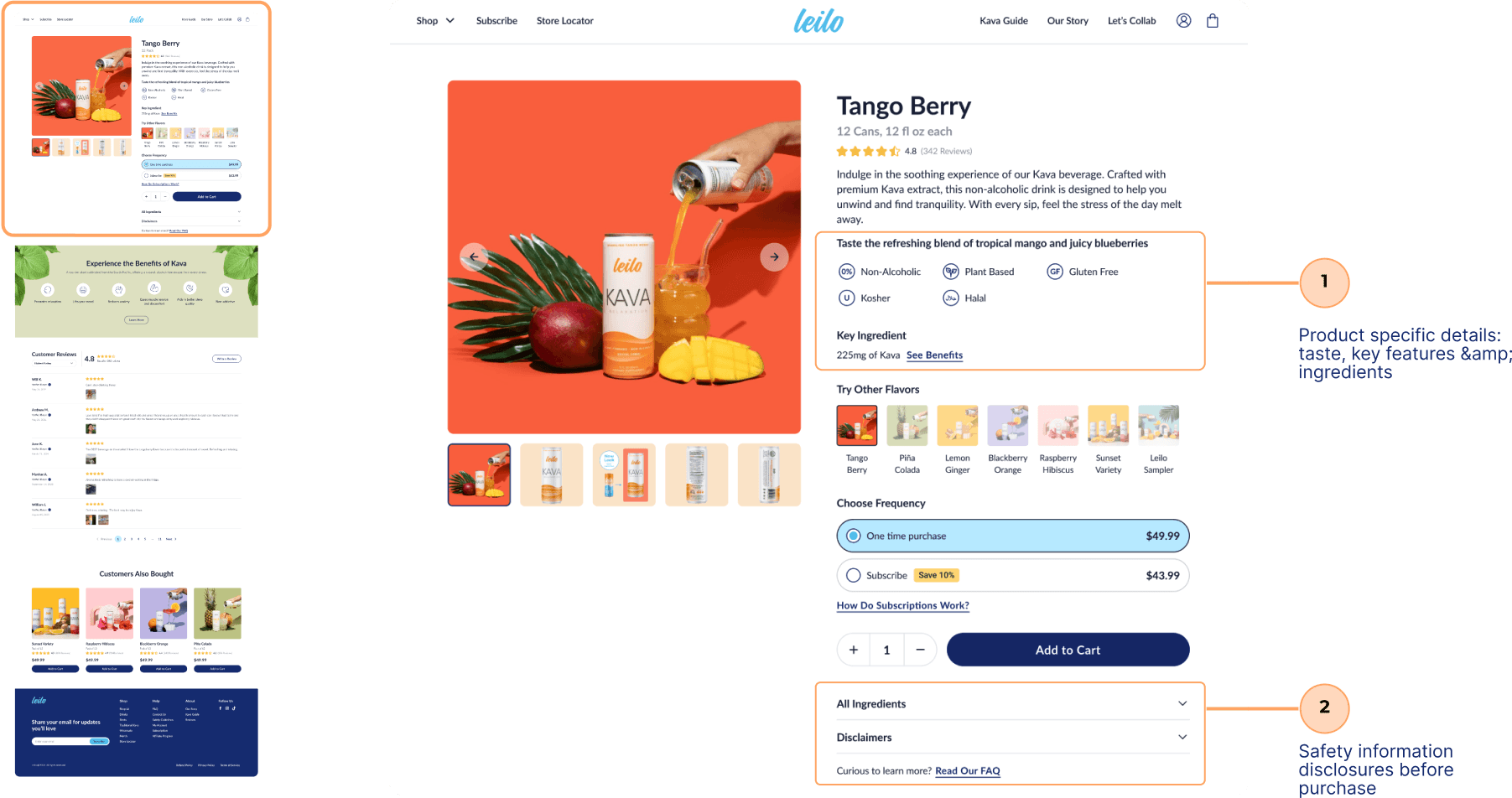
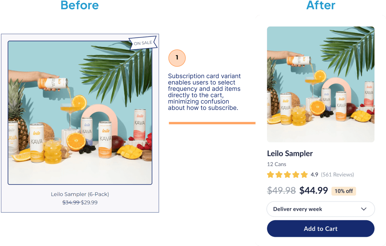
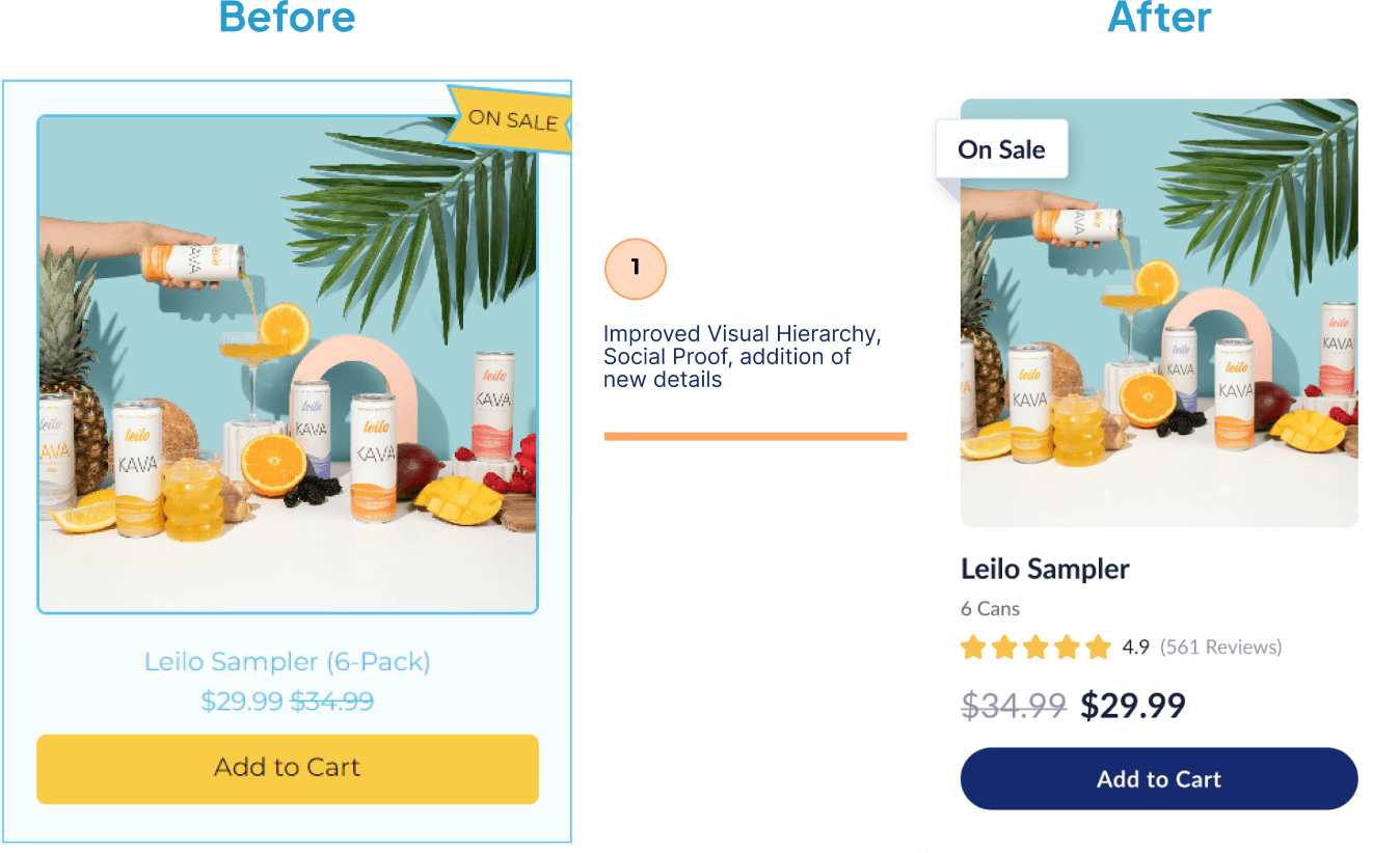
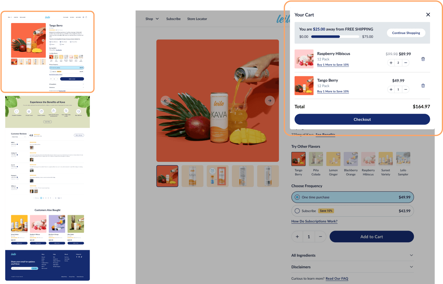
Navigation — We brought key pages into the main navigation and clarified menu labels so shoppers could find products and information more easily.
What changed in usability testing
With the content and interactions refined, we compared the final prototype with the original site using the same tasks as earlier rounds. The prototype group reported higher satisfaction and clarity and completed tasks faster on average. This small study gave us an encouraging signal to build on.
Designing around the information people need
The results supported our direction, while leaving room to learn more. What stayed with me was the connection between content and usability: people needed to understand their choices as well as find their way through the site.
Leilo taught me to start a redesign with the questions people need answered. I helped the team connect those questions to the site’s structure, content, and shopping flow, then use testing to see where the design still fell short. The work reflects how I approach design: bring research and interaction decisions together so people have the information they need to choose their next step.